In my previous post I mentioned Cantabile was getting a new, cleaner, more minimal user interface. Well here is a first look at it:
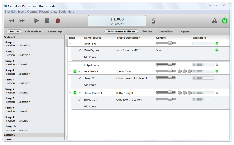
Some things to note:
- The set list and toolbar aren’t functional yet and are there simply as part of the prototyping process. These areas will almost certainly be changing.
- The main Instruments and Effects panel is mostly functional (as is the audio engine sitting behind all of this).
- If you look a little closer, you also notice there are no racks. Plugins have been promoted to top level citizens and the routing between them is much more explicit. Racks will be making a return, but their role will be quite different. I’ll go into this more in an upcoming post.
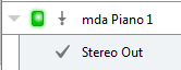
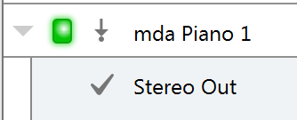
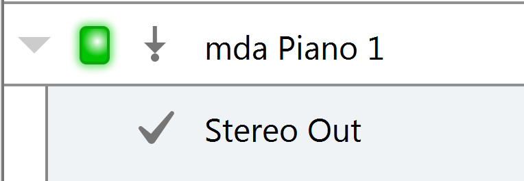
Supporting High Resolution Devices
One of the things I wanted to support in this version of Cantabile from day 1 is high resolution devices. Devices like Apple’s Retina iPads and Macbooks and some of the newer Windows devices make for super clear text and images and once you’ve used one of these devices there really is no going back. I can only imagine and hope these devices will become more and more popular over the next couple of years.
The other benefit of supporting a scalable user-interface is that you can also make things larger on normal devices. eg: touch devices typically needs larger touch areas. So, Cantabile 3 supports user interface scaling from 100% up to 400% — which allows for over-sizing the UI even on super high-resolution devices.
Here’s the same section of the UI taken at 100%, 200% and 400%:
If you’ve got a high-resolution capable device, you can get a better look at Cantabile’s crisp new UI here:
- High-Resolution View (requires high-resolution device, like Retina iPad)
- Raw pixel view (you might need to click to zoom — it’s a big image)
Well, I hope you like the direction I’m going in with this. Feel free to give feedback in the comments, or contact me here.